CLIENT: SUNAC
area: 2 ha
completion: 2019
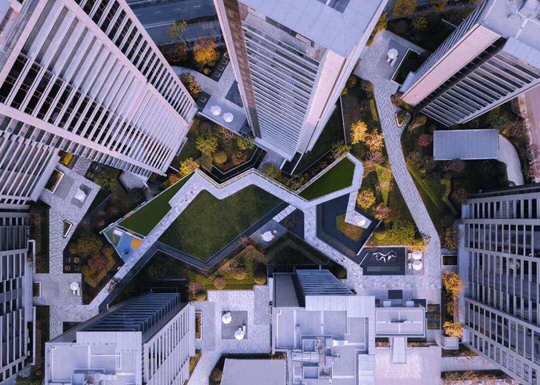
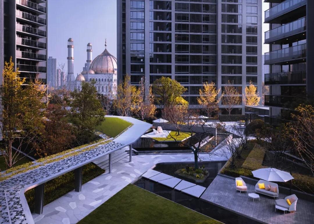
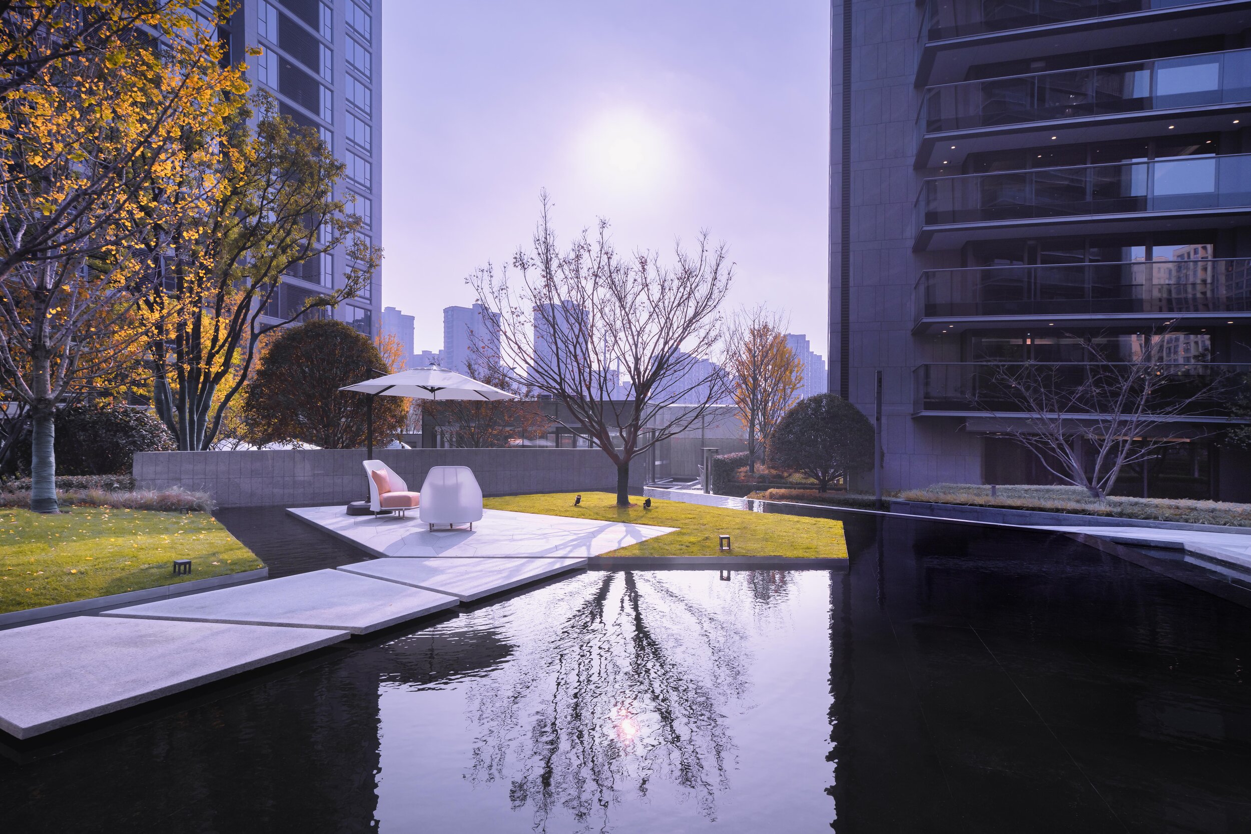
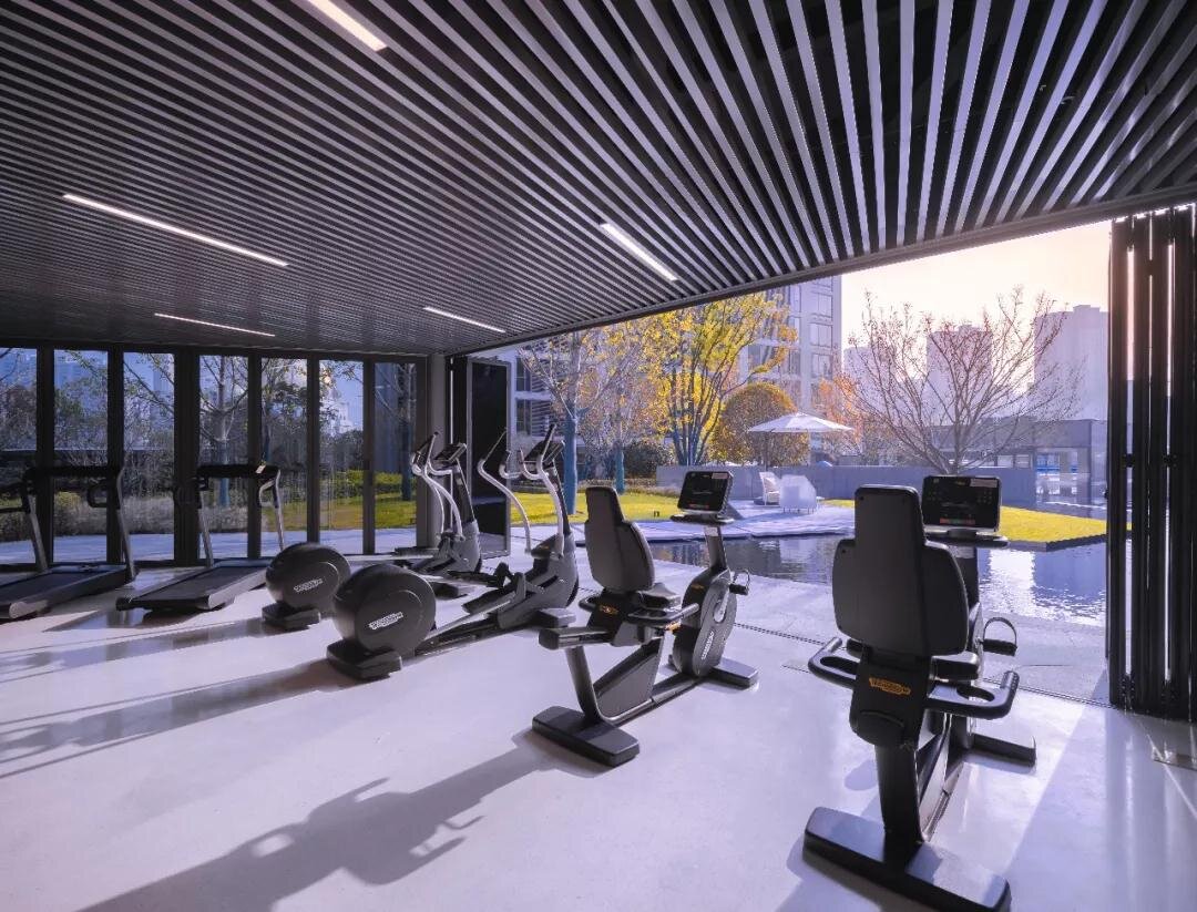
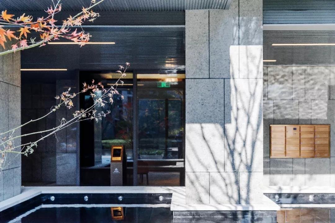
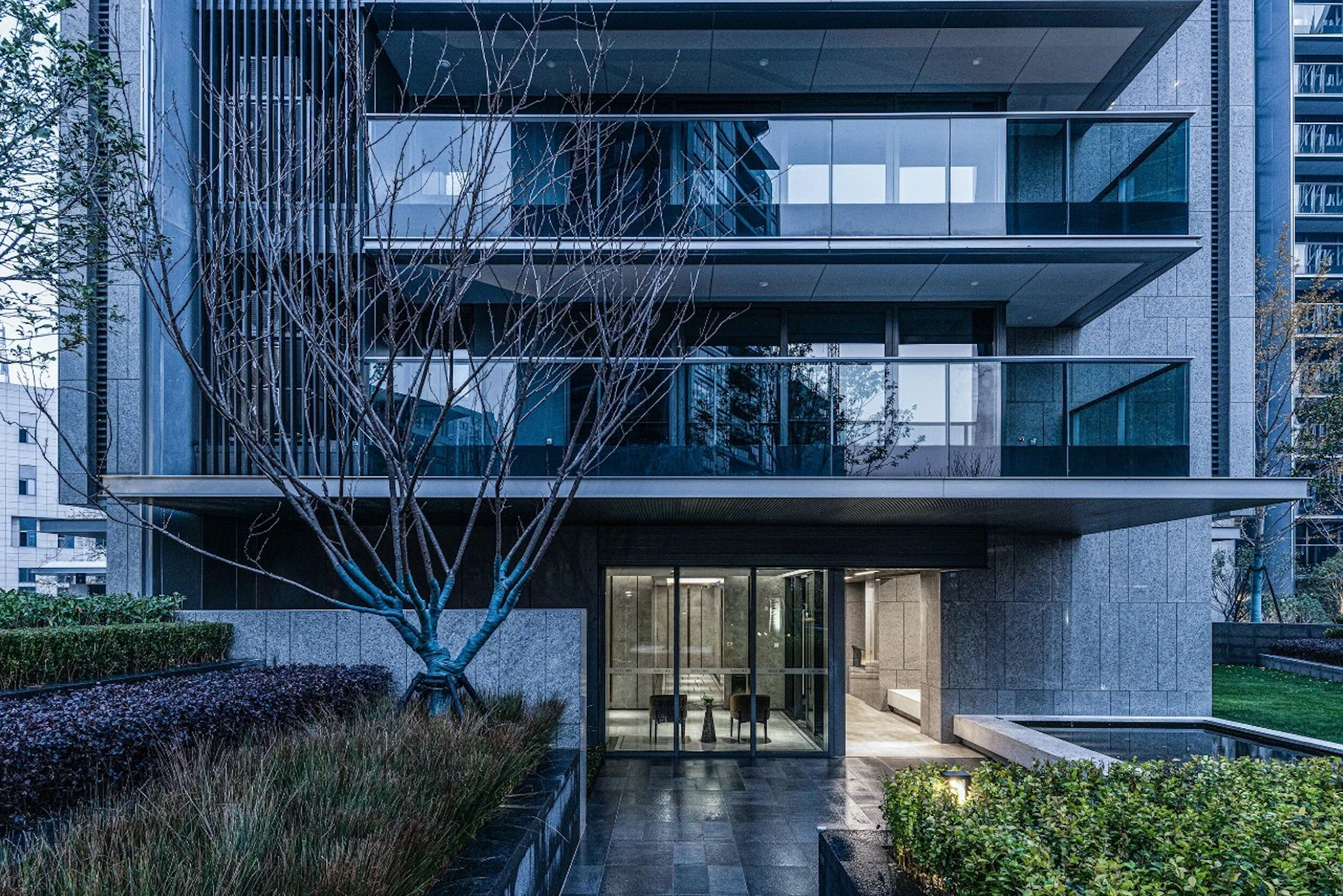
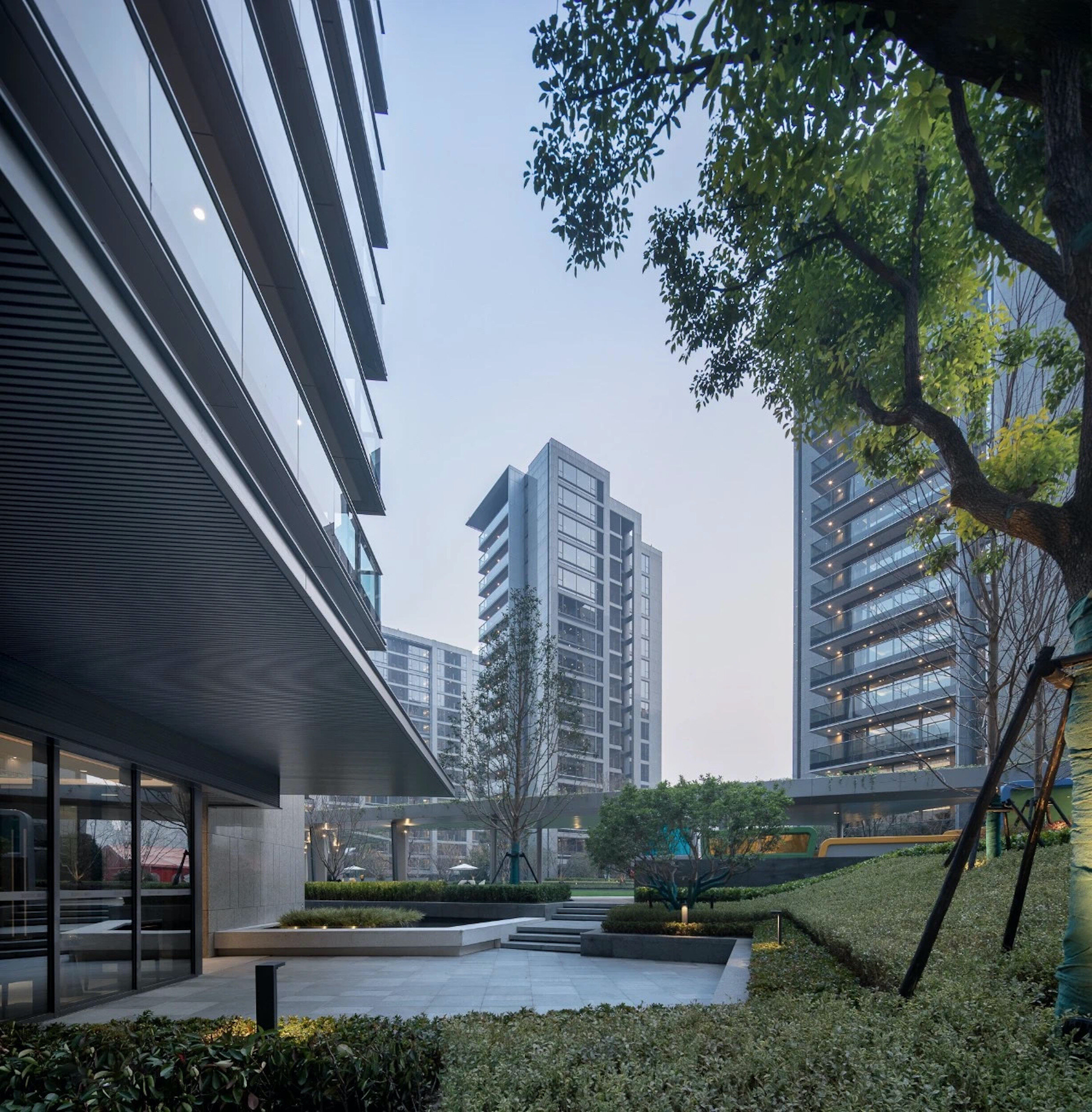
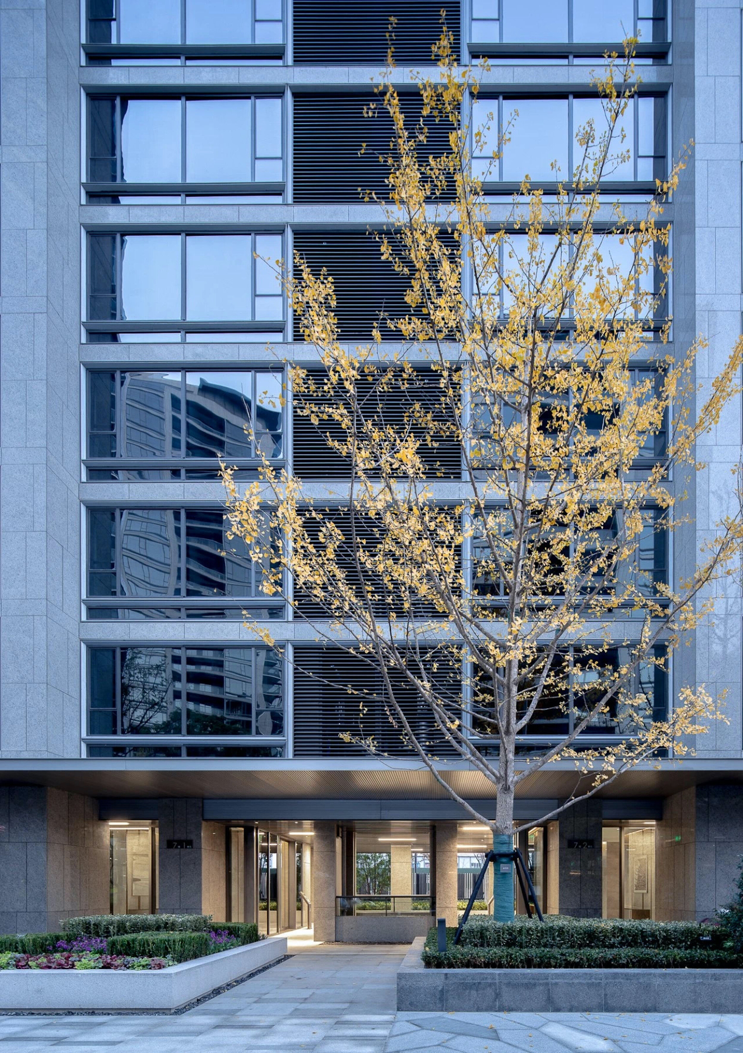
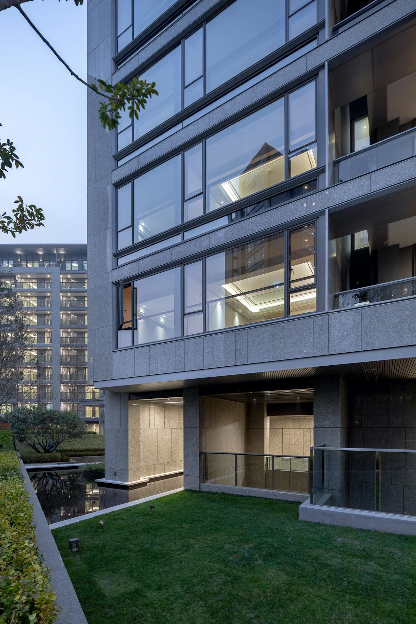
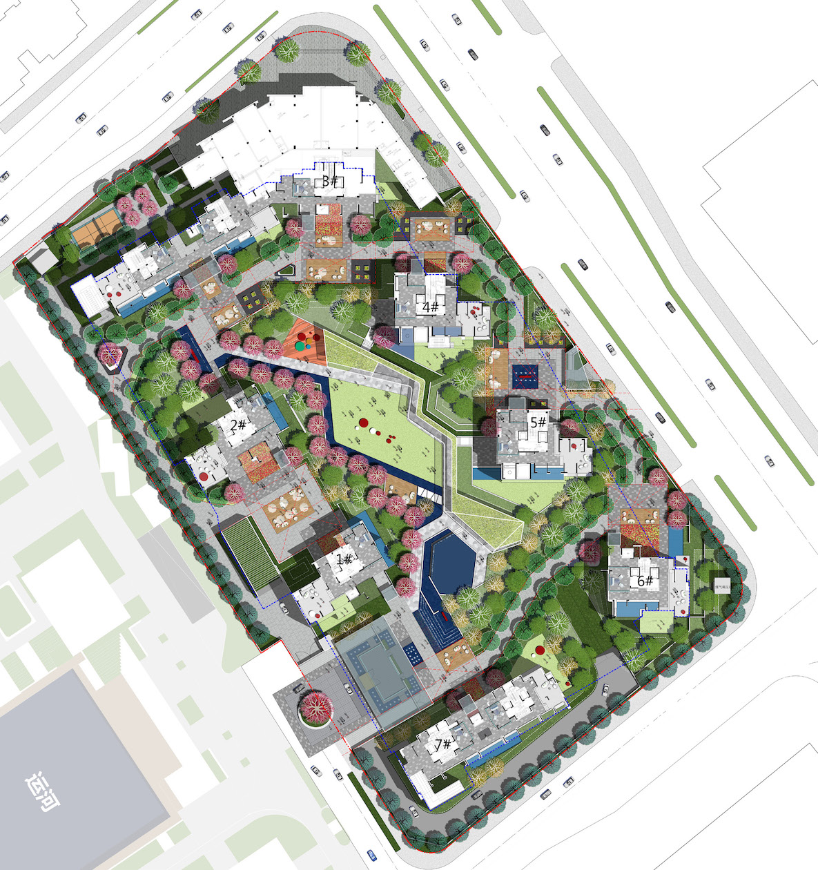
Sunac Wealth Mansion is located in the Qianjiang district, a significant area within the city of Hangzhou, which offers an opportunity for contemporary place making. This site offers a new paradigm and a new direction for the city, rather than falling back on traditional design frameworks. Our landscape design takes its inspiration from the distinct architectural typology of the Sunac Wealth Mansion. We decided to respond to this site by creating a landscape that blurs the division between inside and outside. This involves careful design to facilitate a landscape that offers privacy as well as more open communal or group facilities. The landscape combines this dynamic with cultural reference to the flowing lines of the calligraphic brushstroke. These lines capture the movement and grace of Chinese calligraphy whilst also representing the movement of people in terms of growing up and moving outwards from the home into wider society.
The motif of the brushstroke also allows us to echo the simplicity and elegance of the contemporary architecture whilst gesturing back to traditional aesthetic form. The brushstroke can capture movement, density and flow in a single form.
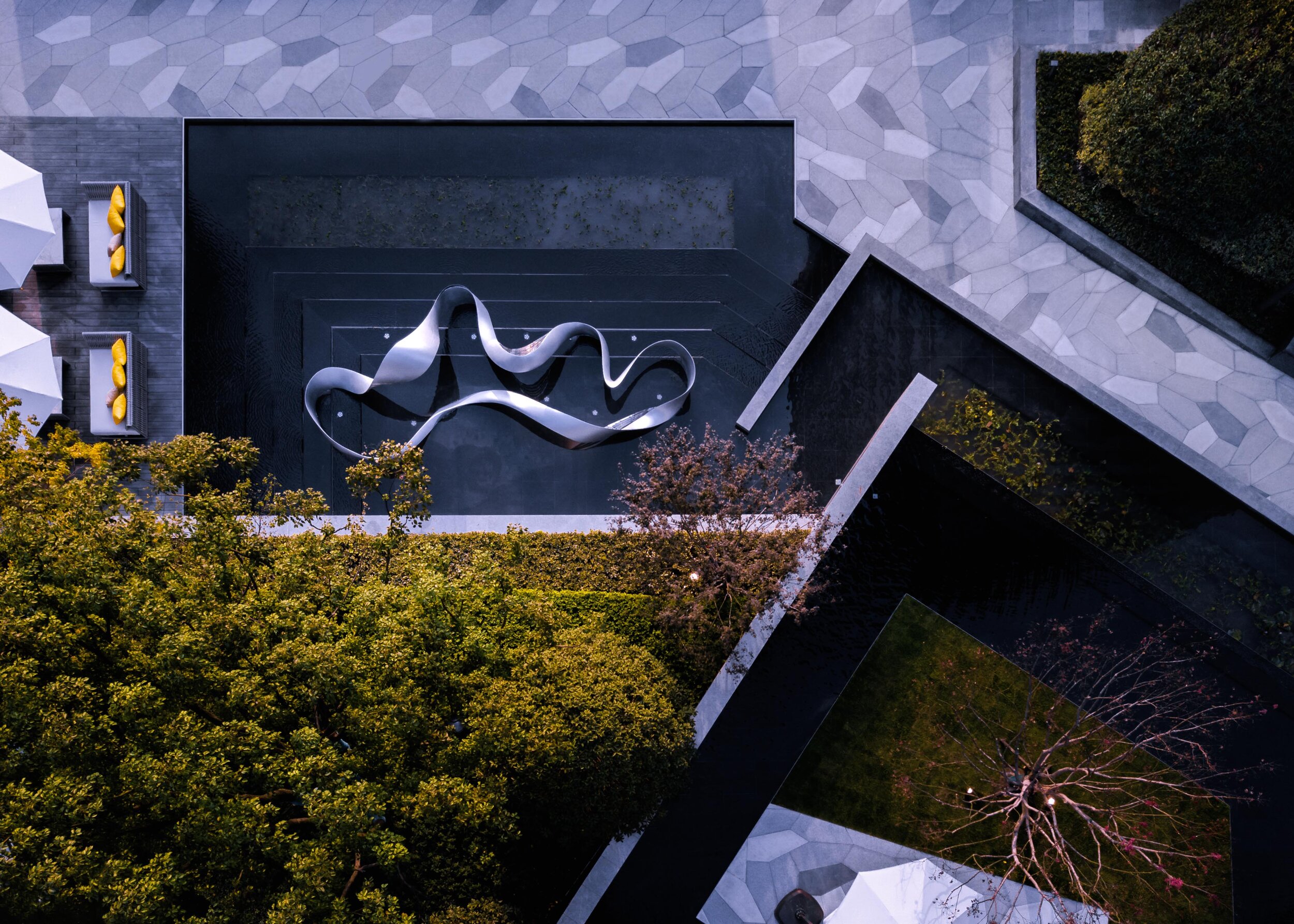
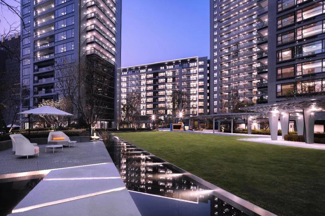
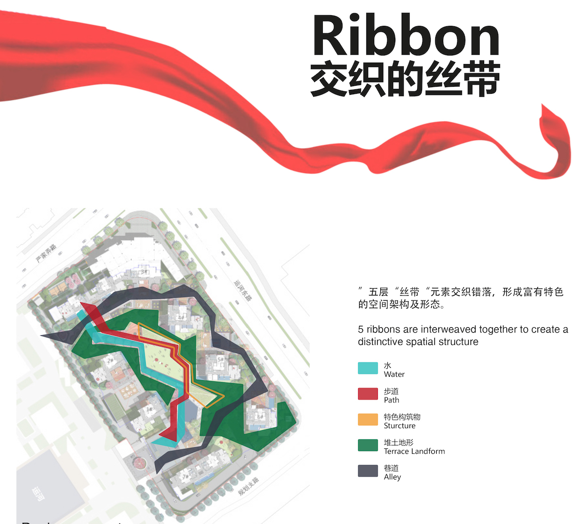
There are five ‘brushstrokes’ in our design. The most important one is the ‘water brushstroke’, which leads you through the development, welcoming visitors as well as leading residents to their home.
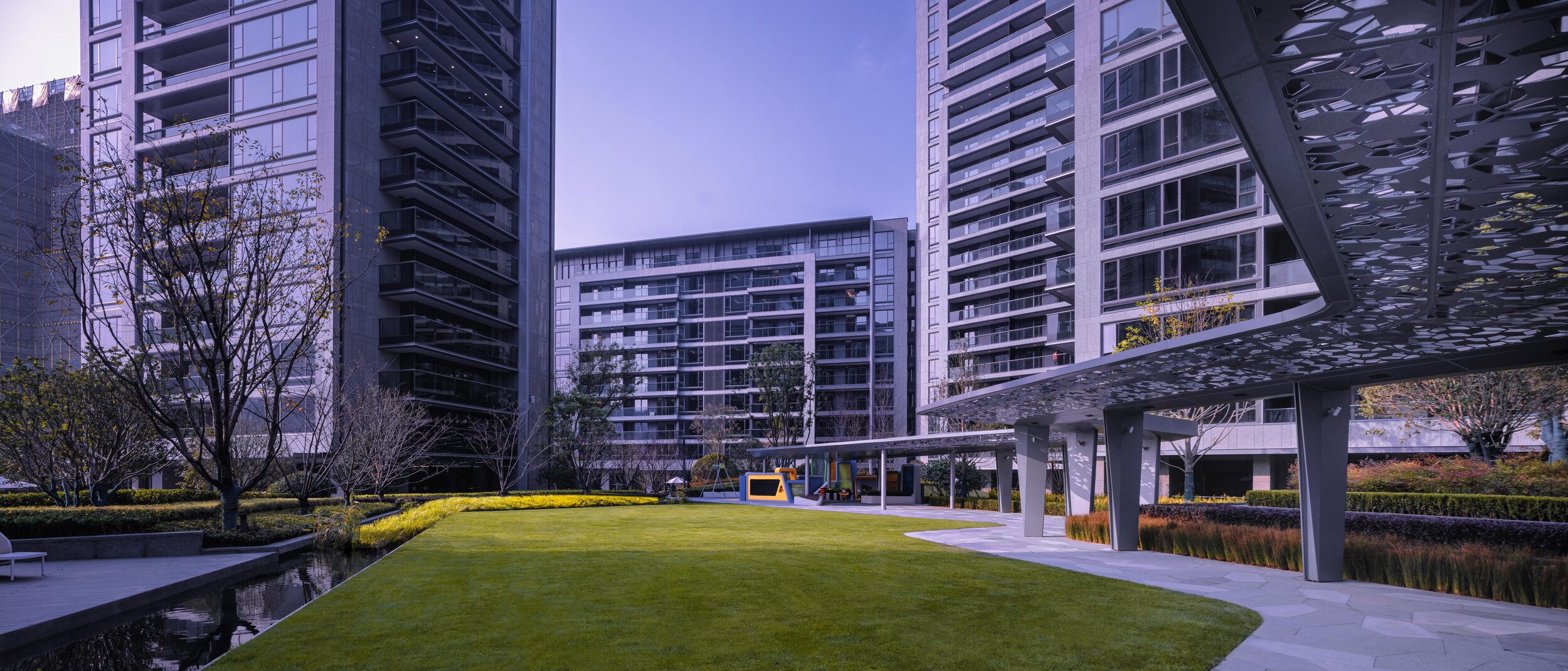
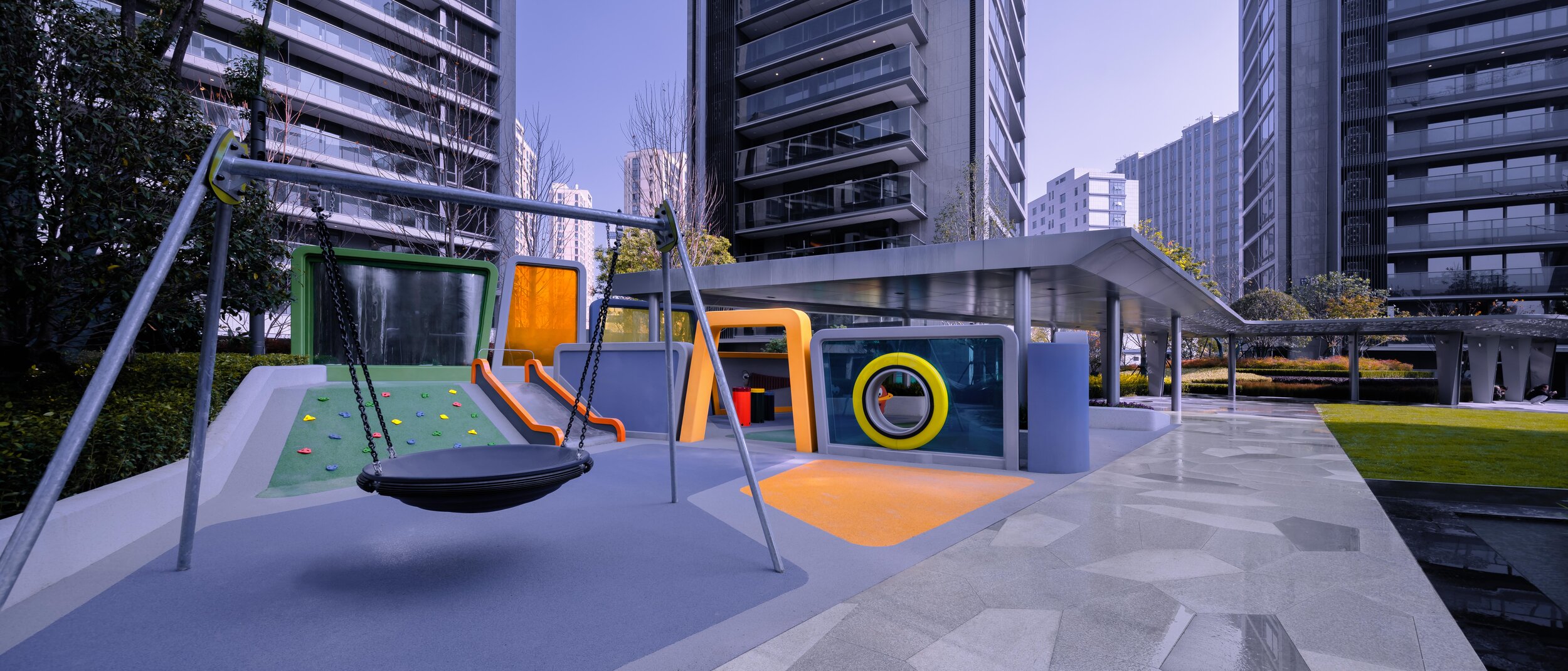
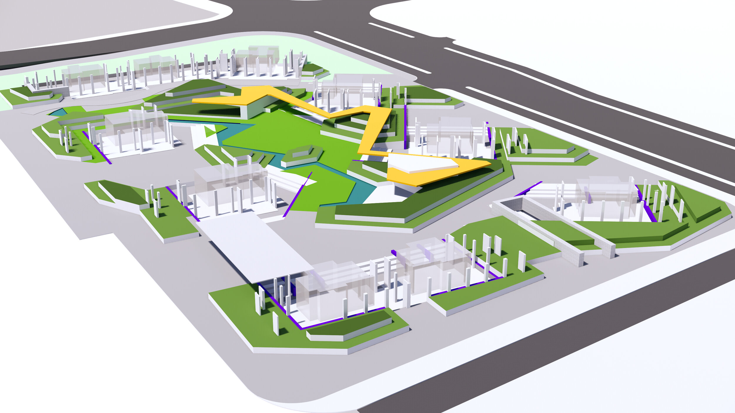
The second brushstroke is the main pedestrian line that runs through the development, and the third brushstroke is formed by a green canopy (structure) which provides a vertical dimension to the landscape. Throughout the site there is a ribbon of green landform, which residents can view from the ground floor of the building. This green space lends definition to the area and functions as another ‘brushstroke’, interacting spatially with the pathways and calligraphic lines. Finally, there is a brushstroke around the border of the site (the alley) which is suitable for exercise and meandering. These ribbons intersect and diverge, creating five different zones that speak to each other.
These ribbons represent a broader trend in landscape design, which foregoes a clear distinction between an interior of a building and an exterior garden. Instead, these ribbons facilitate a continuous landscape that blends the internal and the external. This makes architecture and landscape a combined product, rather than two separate entities, and both are enhanced through this relationship.

